
Redesigning Our Weekly Blackouts Schedule
As you may know, these days I live in Lviv, Ukraine.
It’s war happening, ruzzia attacked us — once again — in Feb 24, 2022. With their full-scale invasion this time. First time they attacked Ukraine in 2014, so the war had been happening for 8 years already.
- I have a separate blog, where I write about the war, if you’re interested. Its name is war.basil.
They target our civilian infrastructure with their missiles.
So we’d give up on fighting, apparently. It’s cold and not cozy without the electricity, why not give some ruzzian barbarian to come to your land and tell you what to do?
Are they idiots to think that way? Sure thing, did you have any doubts?
As a result, each winter starting with the November 2022, we’re having blackouts. For us, the worst blackouts (so far) were during the first winter. Perhaps, because it was unexplored territory, and we did not know what to do.
Over time, everyone adapted, and I see our society is pretty efficient with the blackouts. Now, it’s just a subject of some uncomfortable routine, mostly. Here, I mean only my family. It’s a terrible thing for organisations, especially critical organisations like hospitals and it’s not a minor event.
Yet, thanks for the very professional work of people who work in energy sector, it’s tolerable. As a result, usually we have no electricity for a couple of hours per day. It’s usually from 2 to 8 hours without electricity, depending on many factors.
The energy company (the local one) has their website, loe.lviv.ua and they have their special sub-domain, poweron where they publish the current schedule for outages. It’s all in Ukrainian, and there’s no English version1.
When the outages happen according to the schedule, it’s merely a routine. It’s not scary and it’s rather inconvenient. You have to plan accordingly. The dishwasher, washing machine, cooking, some other activities (e.g. we do lungs inhalation when we’re sick). Everything needs to be planned beforehand.
Usually, we know the plan for the day since the late evening of the previous day. So we can plan.
The city has 6 zones (named 1.1, 1.2, 2.1, 2.2, 3.1, 3.2 for some reason) each of which has its own schedule.
Summer Schedule #
At summer, we had somewhat stable weekly schedules. They looked like this:
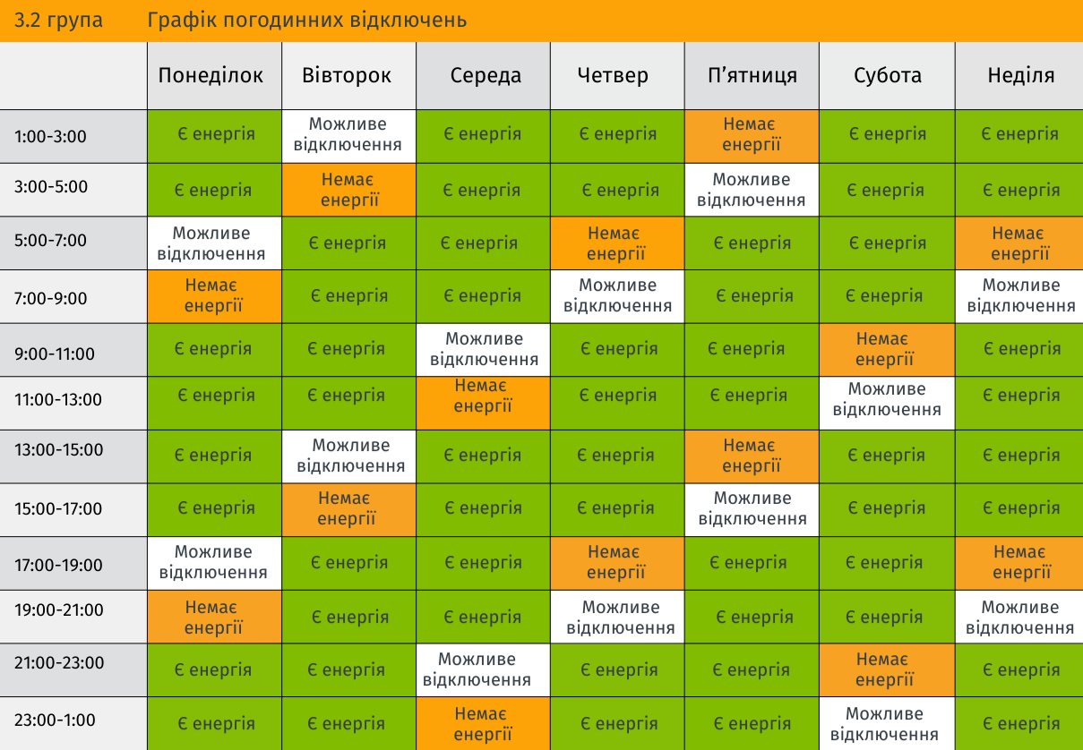
It’s the schedule for our group, 3.2.
- On the left are the hours, from 1 am to 3 am, then 3 am to 5 am etc.
- On the top are the days of the week, starting with Mon.
- The white colour means there could be a blackout.
- The red colour means there would be a guaranteed blackout.
- And the green colour means there would be electricity.
- The texts inside the cells tell you what’s up (I’ve explained already)
- There’s no consistency: electricity, no electricity, probable blackout
It wasn’t that bad, but at some point they decided they want MOOOAR DESIGN!
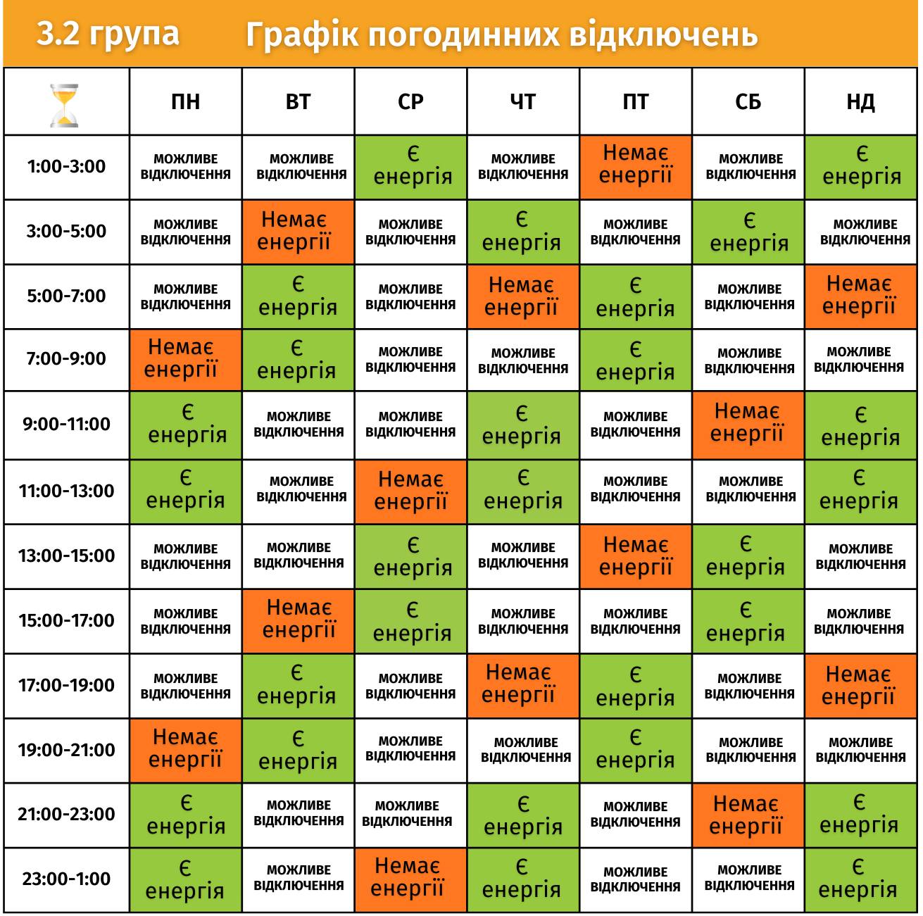
Later designs included all the groups on one page.
Red Lite Green Lite #
I try to not criticize the design work of others, but it’s just very difficult sometimes.
I don’t like this phrase ‘don’t criticize, or if you do, offer the alternative’ too much, because if there’s something that you must stand against, you should do that even without the alternative. Sometimes, it’s just not your job to offer an alternative. You totally can say ‘hey guys, do you genuinely believe that’s the best you can offer?’
To me, honestly, this piece of infographics is an absolute unprofessional2 shit. You can explore the previous infographics by following this link, so to explore the mess of ugly colours.
My main complaint is not that the colours are ugly. Or the font is shit. Or that it’s clearly made by someone who doesn’t know even basics. I can tolerate many things. (However, should I?)
My main complaint is this is just unreadable. Why red and green? Because what?
Red light green light? La-la-la.
Turn on the soundtrack, so we could continue. Red light, green light!
I tried to not criticise this publicly, but it was difficult to actually use that schedule.
So I remade it.
Let’s go! 🎶 RED LIGHT GREEN LIGHT!
Calm #
I like calm redesigns. They shouldn’t yell.
RED LIGHT GREEN LIGHT
Sorry.
I wanted to print that schedule, but it looks horrible on paper. I’ve seen them printed (afterwards3), and they are horrible indeed.
You look at it, and all you see is those white parts.
‘Ah, are those the parts of the light?’ a naive viewer would ask.
‘Oh, poor little kid… No, they are not. It’s when you won’t have energy, maybe. It’s green. When you’ll have your lights back.
RE-ME-ME-M-BAR?! RED LIGHT — yes, yes, wait for it — GREEN LIGHT!
I took the schedule and made it FUCKING BLACK AND WHITE.
How dare you?!
First of all, because I had a black-and-white printer. And I want this fucking schedule to be printed and be present on all my walls. On my farm (aka workshop, aka farm-office place), in my office, at home, at my in-laws home, at my friends, inside my apartment building. Everywhere. I cannot print this shit. It’s unusable.
Second of all. Why would you introduce colours here? It’s pretty much binary. Black for no light. White for light. The paper is white already. So you need only the black colour.
Genius! 🤯
No, seriously. Why would you introduce colours here?
Keep It Simple #
I started to design the layout. It’s going to be simple. There are days, they go from left to right. Look at your Google Calendar, look at your Apple Calendar. We have those days from left to right already.
The hours? Oh, you guessed it right. It’s from up to down. That simple! Watch at the calendars.
That thing they did right. Initially. Almost.
Why would you combine hours by two? Isn’t it less flexible? Or you would like to attack me with more – MOAR — info at my face? So you could just skip one hour to write the other hour twice, right?
There are still 24 hours in your design, sir.
I simplified and made the hours one-by-one. Also, you don’t need the :00 part in there. It’s visual noise.
Logic #
Then. The blackouts. That’s the essential part. All I need to know is when I won’t have electricity. That’s all I need to know. If there’s maybe, I want to know that too. Maybe is ‘more likely I won’t have electricity as well, but fingers crossed.’
You know, sometimes it’s just so very difficult to go to the essentials. Do I need to know when there’s electricity. Maybe, but most times, if the blackouts aren’t too horrible, the electricity is the normal state. I want to know when I’ll have no lights.
Visual Realisation #
I draw black-framed bars for when there’s a blackout. And I used dotted lines for when there’s maybe. To make it more readable, I wrote the legend in text, including the time frame. That’s it. Introducing some rounded corners is a style thing, but it also helps to distinguish things visually, when there’s one thing after another.
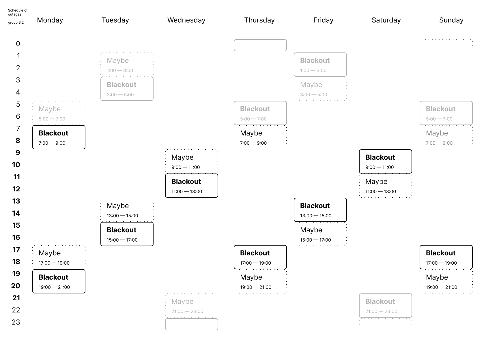
This is the English version, the Ukrainian version is also available.
Day and Night #
Also, I distinguished day and night. We don’t care if there’s no lights at night. Usually we sleep during the nights. Although, it’s still better to know: all our home appliances work at nights. Those are mostly dishwasher and washing machine.
So, what we care about is timing since 7 am till 9 pm. After 9 pm we get ready for the night, before 7 am we sleep. Made the night part more bleak.
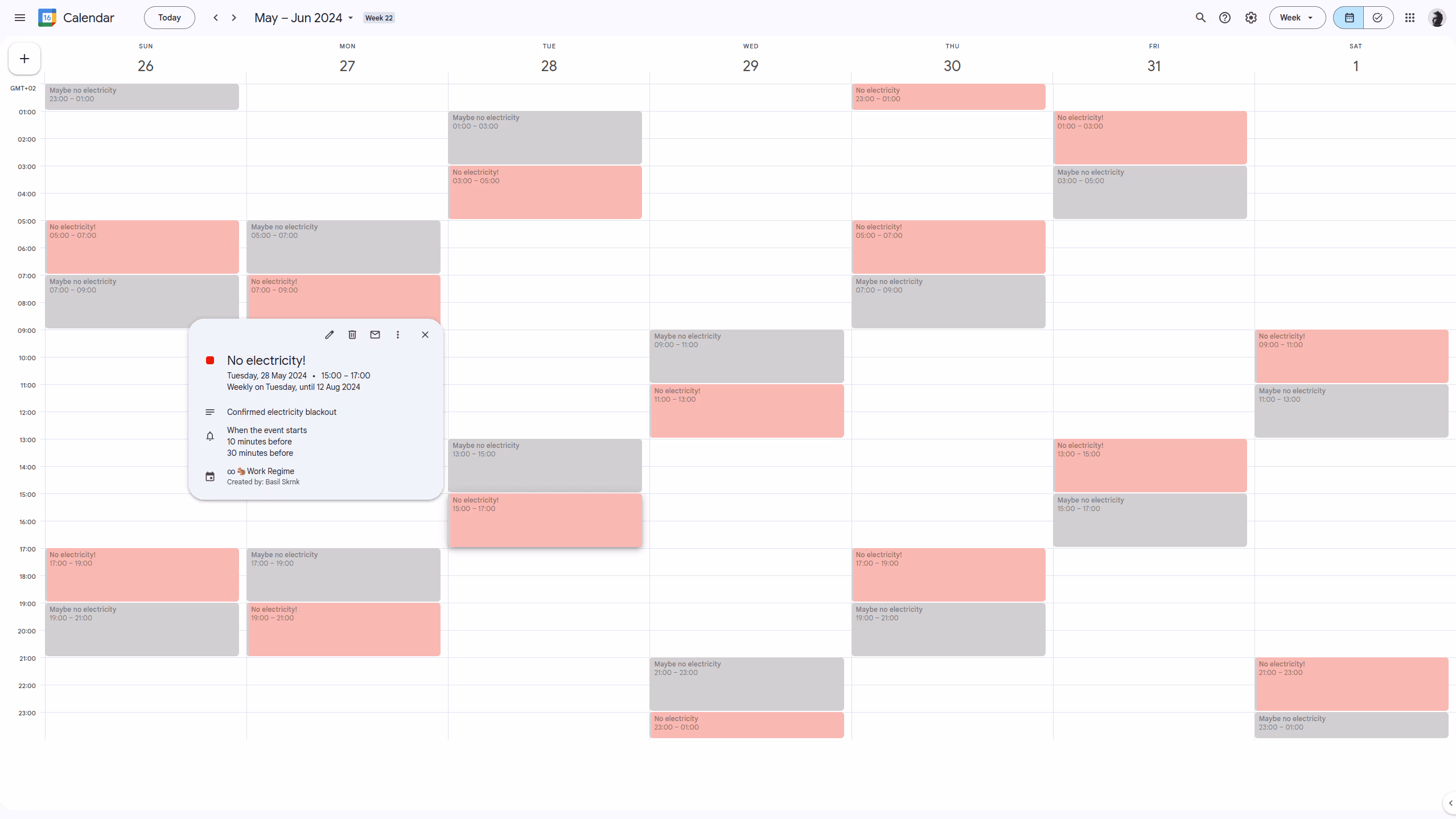
Google Calendar #
With the help of ChatGPT, I designed .ical files that could be imported to my Google Calendar. They were recurring and they have notifications (for the daytime events only).
With all the other task turned off, they look like this:
Impact #
I exported it as pdf and printed. That easy. We used it for months, before the blackouts schedule was cancelled.
- I haven’t designed other groups, as I had no need for that, and I had no resources to publish it publicly at the moment. (This post is written a bit later.)
No English version, yet? I don’t know. Maybe they need some help for that, maybe there are not many foreigners in Ukraine these days without the knowledge of the local language. ↩︎
I understand that the company that issued that isn’t a design company. And they should have never faced this need to do that. Still, ↩︎
Gave away for businesses around my residence, so they’ll use the better schedule. They were thankful and they put the schedule on their walls. (The previous one was just lying around.) ↩︎

