Painted My Kindle Light Gray
Recently, I realised I don’t like that my Kindle’s colour is just too different from it’s page colour.
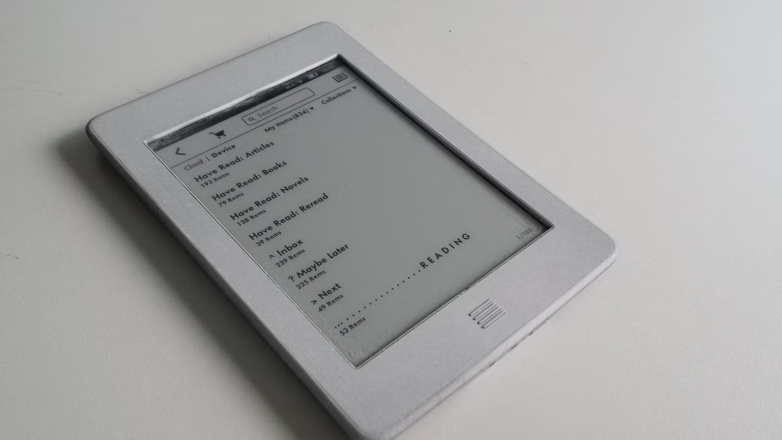
Take a look at this:


It looks good, until you realise that if the whole reader would sport the same colour, it’ll be just much better. Since my Kindle slowly becomes not-so-new, and its paint starting falling apart, I decided it’s a good idea to try to paint it the colour I want.
I really like the result. Did it a couple of weeks ago, and I still like how it looks. It’s not exactly the same colour, but I like it much more. My painting isn’t too neat, as you can see. But I tried to make it so, as I wanted to paint the edges too. I don’t really want to see the location and the time. I want to balance it by not completely removing, but also for it to be not present all the time when I read a book. I don’t want these things to distract me from reading.